A visit to Denver’s Clyfford Still Museum
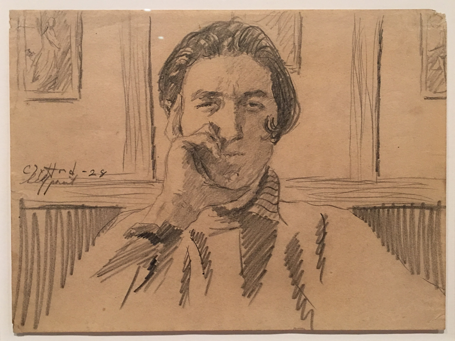 PD-46 (Self-Portrait), 1928, graphite on paper
Who was Clyfford Still and why should we care? The short answer:
Clyfford Still was among the first generation of Abstract Expressionists who developed a new, powerful approach to painting in the years immediately following World War II. Still’s contemporaries included Philip Guston, Franz Kline, Willem de Kooning, Robert Motherwell, Barnett Newman, Jackson Pollock, and Mark Rothko. … Described by many as the most anti-traditional of the Abstract Expressionists, Still is credited with laying the groundwork for the movement. (source: Clyfford Still Museum)
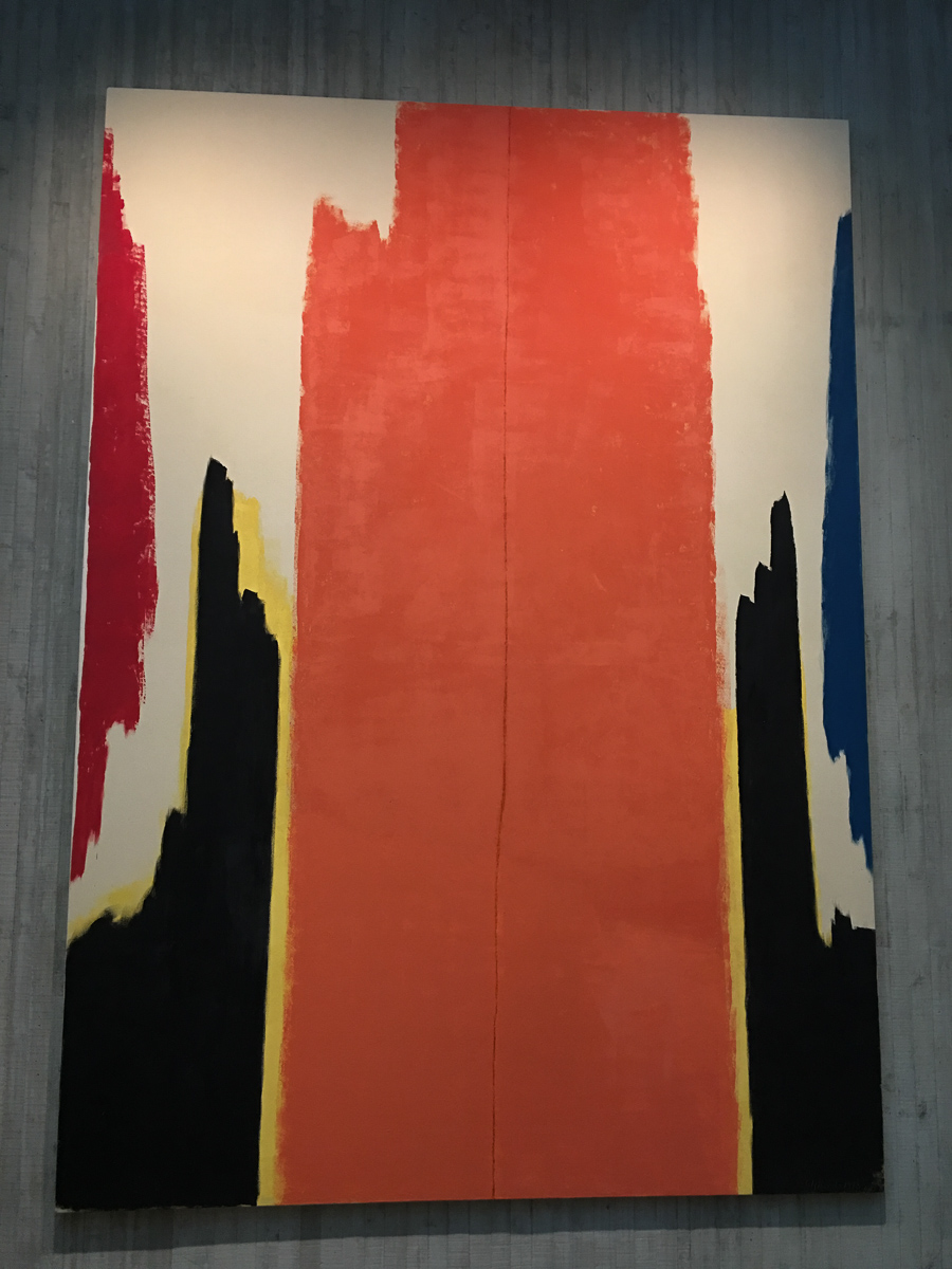
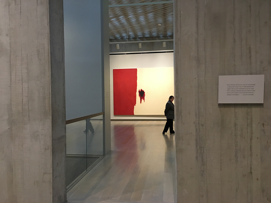
A visit to the Clyfford Still Museum a few days ago left me thinking about these questions in a more thoughtful way than I had after my first visit years ago. My immediate reaction to his work was dismissive; there’s something about the jaggedness and aggressiveness of the shapes and colors of his most well-known abstract expressionist works that leave me with a viscerally negative reaction. Because of his place in history, I recalled the words of one of my favorite art professors and had thought of him as one of the “old dead white guys” in the art world.
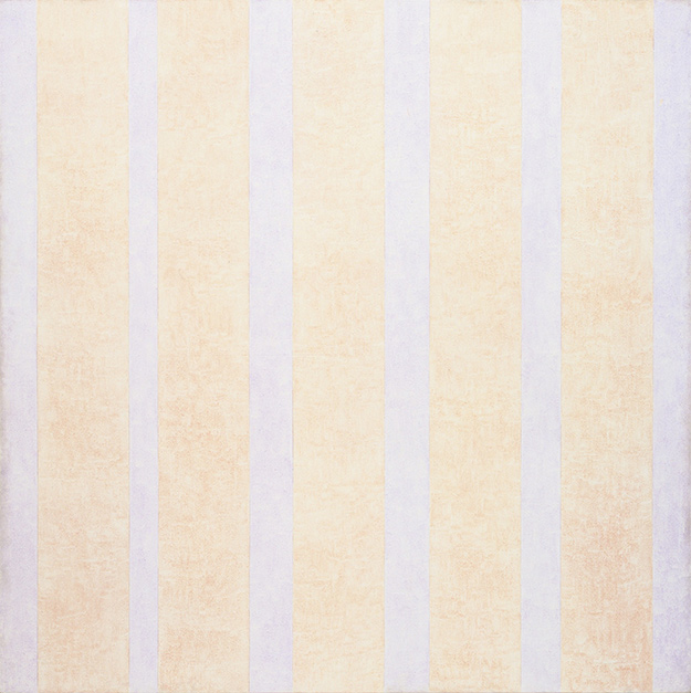
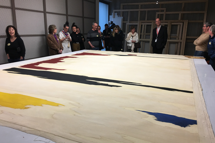
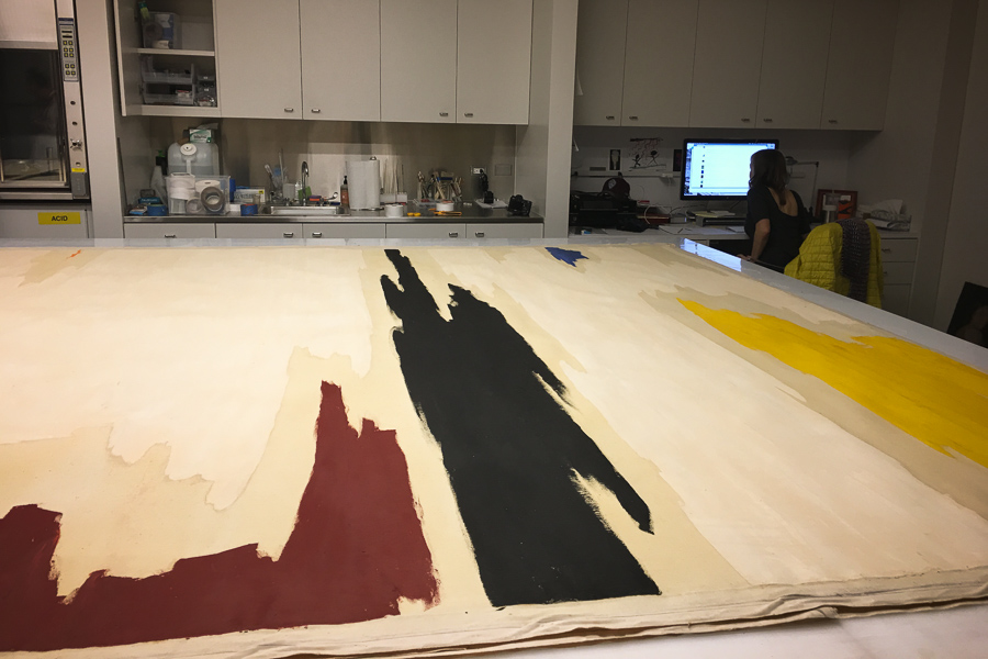
Last Friday, a group from my studio building were treated to a tour by Dean Sobel, director of the museum, and because of this, I had reason to look at things more closely. The works on view this time were a collection of his later abstract works curated by Julian Schnabel. Several of them are monumental in scale, and 15 of them had never before been on public view.
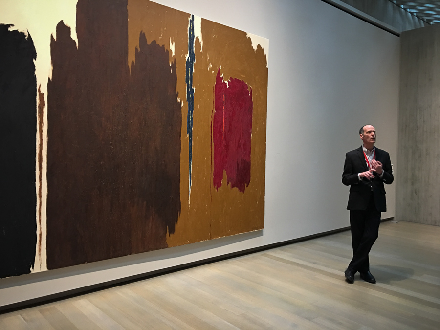
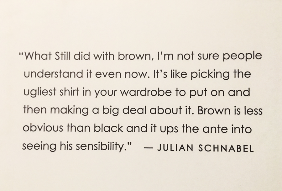
So much brown!
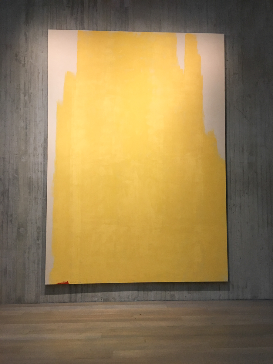
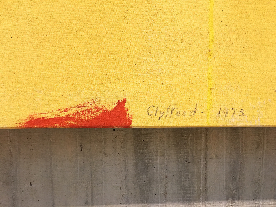
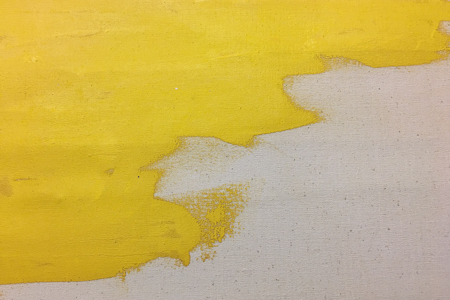
Even now not attracted to the overall look of many of these works, I did spend more time looking closely at the surfaces and the paint handling and have found my entry into them. I do find myself persuaded by the textures and brushwork, and especially the intriguing details like the tiny spot of red in a sea of yellow.
Although he was described by art critic Clement Greenberg as “one of the most important and original painters of our time—perhaps the most original of all painters under 55, if not the best,” he had a famously adversarial relationship with the art world, given to writing scathing words directed at dealers, galleries, museums, collectors, and fellow artists. He limited sales and exhibitions of his work, making it clear that he wanted complete control over its presentation. As Neal Benezra, director of the San Francisco Museum of Modern Art, says: “Nothing was an accident in his work, and nothing was an accident in terms of the way he presented himself to the world.” Eventually he withdrew from the art world altogether and painted in solitude until his death in 1980.
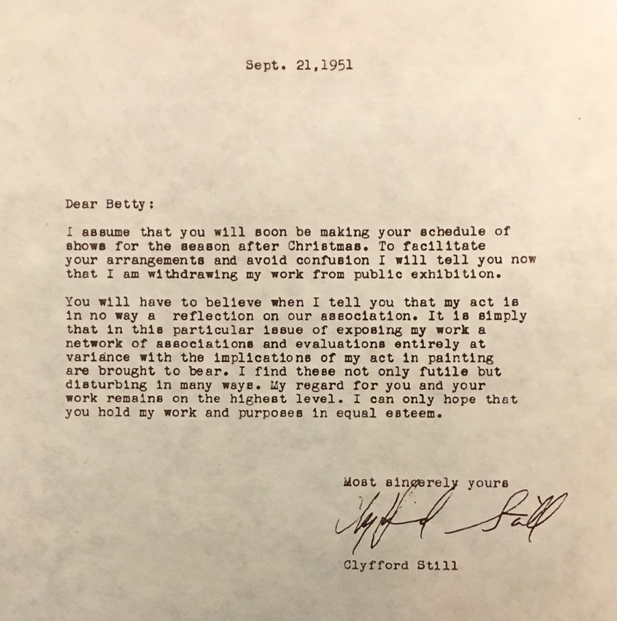
Letter to Betty Parsons, Still’s dealer
The specifics of how his namesake museum came to be are detailed on the museum website, and Geoff Van Dyke gives an interesting account of Still’s history in this article from 5280 Magazine.
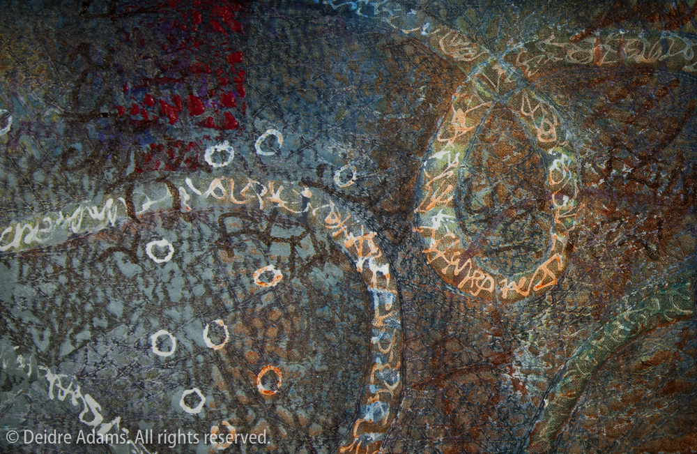
By far the best part of the tour was the behind-the-scenes visit to the conservation room, where we got a close-up view of some works which had recently been unrolled after decades in storage tubes. As to be expected after storage in houses and a barn for many years, some of the works in the museum’s collection have some serious conservations issues, including cracks and flaking paint, pigment/medium separation, imprinting from wax paper or plastic that was rolled up with some of the paintings, and other problems. But in a way, I think that’s part of the attraction.
Clyfford Still Museum director Dean Sobel discusses the conservation work done at the Museum
A close look at the canvas – primed with rabbit-skin glue instead of gesso
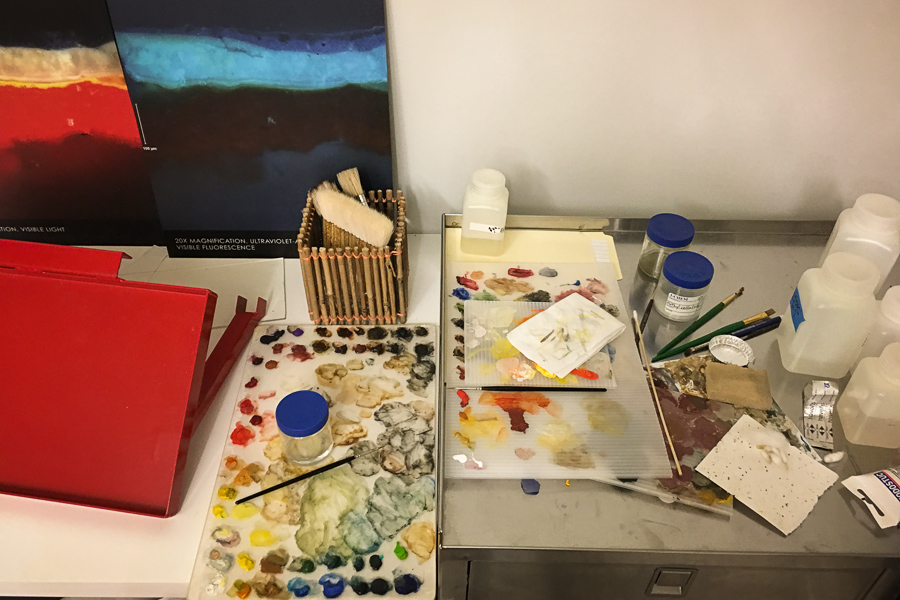 Tools of the conservator
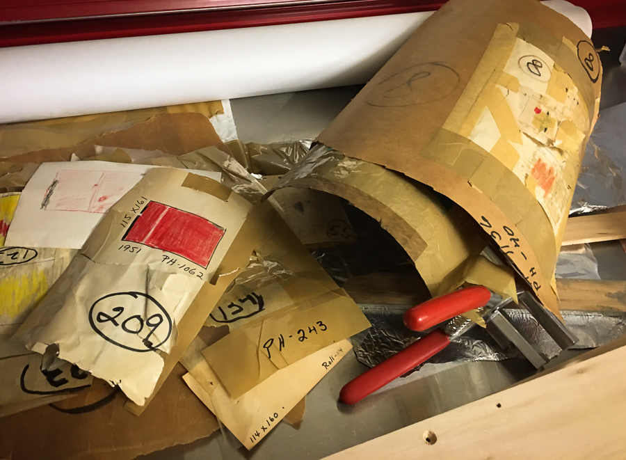
Rolled paintings were stored on tubes with detailed labeling
This visit prompted me to want to learn more about Still’s life and work. He was definitely a man with an outsize ego and wasn’t afraid of what anyone else thought. The most interesting thing I found was a YouTube video of his reading aloud from his catalogue introduction for a 1959 exhibition at Albright-Knox Art Gallery in Buffalo, New York. This demonstrates oh so very clearly what he thought about the art world. Still’s words (with my emphasis in places):
During the 1940s, it was my privilege to have my work condemned on the premise that it had no antecedents; that I was not a reasonable or logical link in the chain of continuity which among professional exploiters in museums and in the writing world is considered necessary or what they call Art.
This was made clear first by newspaper and magazine reviewers in San Francisco. Later, New York writers took up the cry. The painters followed, and until the 1950s, my aloneness was rather unique and in retrospect, highly pleasurable.
Clearly I could not long escape such a happy position in view of the interest the work had created among many people. Even an avaricious interest if I would judge from those I had to turn away when they requested to buy them. By 1959, however, the deluge was in full swing in reverse. Therefore when a group of paintings was hung in the Albright Gallery in Buffalo, New York, I felt the time appropriate to link the past with the present in a way that would provide some continuity, not for those who did not want to or could not understand, but to make clear, as I could make clear with words, my reaction to the entire matter of art history.
…
To add to the body of reference, or “sensibility,” which indulges homage or acquiescence to the collectivist rationale of our culture, I must equate with intellectual suicide. The omnivorousness of the totalitarian mind, however, demands a rigor or purpose and subtlety of insight from anyone who would escape incorporation.
Semantically and ethically, the corruption is complete. … Witless parodies are displayed as evidence of social artistic commitment, and qualitative arrangements are presented as evidence of access to supernal mysteries. The rush to betray, in the name of aesthetics, or “painting,” an imagery born in repudiation of socio-aesthetic fallacies becomes a popular, but sinister, measure of its power.
Unknown are the crimes not covered by the skirts of that ubiquitous old harridan called Art. … The impudence and sterility which so hypnotically fascinate the indifferent perform a sordid substitute for responsibility and truth.
Hear him in his own voice here, which gives you a good flavor for the man, the sappy piano backdrop notwithstanding. Especially interesting is the dripping disdain with which he utters the word “painting” at about 8:20.
And finally, here’s a bit more conventional video about Still and the museum.